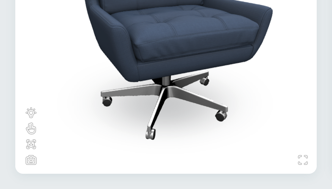
The Embedded UI
The Visual Component provides a built-in set of UI buttons and modals known as the Embedded UI (or sometimes referred to as the Native UI) that enable common features like augmented reality (AR), full screen mode, and product snapshots right out of the box.
Enabling the Embedded UI
Adding the Embedded UI to your 3D view is as easy as adding a new tag — <av-native-ui> — inside your Visual Component, as a sibling to the <product> tag:
<atlatl-visual ...>
    <av-product ...></av-product>
    <av-native-ui>
        <!-- UI content will go in here -->
    </av-native-ui>
</atlatl-visual>
From there, adding additional features and UI buttons is as easy as adding specific tags within that container:
- Fullscreen mode:
<av-fullscreen> - Augmented reality:
<av-ar> - Snapshots:
<av-snapshot> - Custom UI buttons:
<av-native-button>
Adding feature buttons to the Embedded UI
To have these features' buttons displayed in the Embedded UI (i.e. within the Visual Component), the native-button attribute must be added to the feature's tag.
<av-native-ui>
    <!-- This will show the fullscreen button in the Embedded UI -->
    <av-fullscreen native-button />
    <!-- This will make AR functions available but will NOT show the AR button -->
    <av-ar />
</av-native-ui>
Without it, the functionality of that feature will be made available to the rest of your page, but the button itself will not be shown on the UI.